Mechanical Scribe
A hypermedia* studio from award-winning data journalist Chris Wilson specializing in interactive dataviz, original games and quizzes, experiments with AI, real-world simulations, and much more, always meticulously sourced.
The goal is to surprise, delight and inform readers all at once! Bring your most quixotic ideas or intractable topics.
*“Interactive multimedia” in fewer syllables. Unless you have to define it.
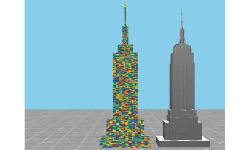
Gallery

Let's Chat!
Interested in anything you see here? I'd love to hear from you! Or read more about the services I offer and frequently asked questions (mainly by me).
Skills
Journalism: Reporting, writing and editing, particularly on AI, STEM (esp. behavioral science), politics and polling, anything else with large datasets, weird things
Programming: Javascript, Node.js, Python (mainly for NLP and machine learning), R, Mathematica, HTML5/CSS
Web Frameworks: React, Next.js, Tailwind, Wordpress (including Gutenberg), Django
Data Visualization: d3.js, p5.js, canvas, Datawrapper, Raphael.js
About Me
I’ve been a data journalist for over 15 years, dating back to when that was a catch-all phrase for any reporter who could code. (It still is.) My specialty is interactive visualization and storytelling (Slate, Yahoo News, Time.com) with occasional forays into print (TIME, Bookforum, etc.) I now work with clients from a variety of industries.
I live in Washington, D.C. with my wife and young son. We also have two Samoyeds, two cats and one piano. It’s joyously unquiet.
Oh, and ask me about my novel about an out-of-work data journalist who’s mistaken for Bigfoot. Particularly if you’re a literary agent!
C.V.
Books and Peer-Reviewed Publications
- RaphaëlJS: Graphics and Visualization on the Web. O’Reilly, 2013
- The Canopy Birds Unpublished novel, 2014
- Predicting competitions by combining conditional logistic regression and subjective Bayes: An Academy Awards case study Annals of Applied Statistics, December 2021
- A Tale of Peaks and Valleys: Sinusoid Relationship Patterns Between Mountainousness and Basic Human Values Social Psychological and Personality Science, August 2021
Education
- University of Virginia, 2001-2005 (English)
- Stanford University, 2021-2022 (graduate natural language processing, non-degree seeking)
Awards
- 2015 Eppy for Best Use of Data/Infographics with 1 million-plus unique monthly visitors
- 2010 Media Vanguard Award for Best New Web-Publishing Idea Factory
Blog Posts
Graphing the Glissando in "Rhapsody in Blue"
George Gershwin's "Rhapsody in Blue" famously opens with a trilling clarinet that rockets up more than two octaves in what's known as a "glissando," in which an instrument's pitch bends across a span of notes in a continuous climb or descent rather than stopping at discrete frequencies. Here's an example from the Columbia Symphony Orchestra, which probably sounds familiar:
Visualizing Algae Growth
The subreddit /r/dataisbeautiful/ runs a monthly visualization contest based on a different dataset each time. The Jan. 2018 contest challenges designers to visualize the growth rates of 19 species of algae under 8 different combinations of light and temperature, for a total of 152 data points.
Pascal's Triangle as a Galton Box
There's a wonderful math toy known as a "bean machine" or "Galton board" that demonstrates normal distributions though a simple mechanism: A large number of small metal balls—or beans, if you prefer—are fed through an staggered lattice of metal pegs, which, when the ball collides with the peg, causes it to drop either to the left or the right. Here's a simple demonstration from Wikipedia.
Google Ngram Data for Every Word in the CMU Pronunciation Dictionary
Google provides fantastic data on the frequency of words and ngrams in all the books it has scanned, in many cases going back centuries. The only drawback is that these files are enormous. The unigrams alone are 4GB when compressed, not including numbers and punctuation.
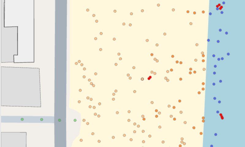
Visualizing Random Walks with Canvas
I don't use Canvas all that often on the client since SVG-based tools—mainly D3—are better suited for editorial data visualization. But I was thinking about random walks recently, which involve drawing thousands of dots and refreshing them several times a second, and figured it would be an interesting use case for Canvas's capabilities. Here's a little line that start's out with 10,000 points and updates 10 times a second, drawing 100 new random points and shedding the oldest 100. (Green is the newest, red is the oldest.)
A curious property of simple functions
The other day, I was thinking about how, when you first learn calculus, the way you find the derivative of a function at a certain point is to find the slope of a line that passes through two very close points.
Bargaining with Stack Overflow and other stages of developer grief
A few weeks ago, we published a little app on Time.com that uses unit-level Census data to show you how many single people in your city meet your dating standards. Using about 15 million records from the IPUMS project, we asked the user for his or her preference in education, income and other demographic questions and estimated what percent of the population matched those criteria.
The Joy of Screen Scraping
I was tickled pink the other day to see that over 1,000 people have downloaded the downcache module I maintain on NPM. The way it works is simple: You request a web page, just like you would with any other HTTP module in Node, and in addition to returning the page it saves a copy of the response to your machine. If you request it again, it loads the cached version instead of making another trip to the server.
Recreating the Atlantic's Netflix database with Node
The Atlantic published a delightful exploration last week of Netflix's surgically precise category descriptions, which include gems like "Critically-acclaimed Irreverent Crime Movies" or "Dramas starring Charlotte Rampling" (whoever she is). Because Netflix identifies the categories with integers in the URLs, Alexis Madrigal was able to scrape each one of the 76,897 unique categories names. It's data mining at its best.
We need new sentences that use every letter of the alphabet
I've been spending a lot of time with Google Webfonts recently, looking for a semi-coherent font ensemble for this site. By default, every font is displayed in the sentence "Grumpy wizards make toxic brew for the evil Queen and Jack."
Synesthete.org's incredible grapheme-color synesthesia test
For as long as I can remember, I have associated specific colors with every number and letter. I first encountered a description of this condition in Richard Feynman's "What Do You Care What Other People Think?":
The most popular two-letter combos in English
I was pondering how one would make a premium gibberish generator the other day, which led to a short investigation of which pairings of letters are legal in English and how common each combination is. This diagram shows a basic heat map of letter combinations, using '^' to mark the beginning of a word and '$' to mark the end. The data here is extracted from every item in the "2 of 12" list of dictionary words available on Kevin's Word List page.
Using D3 with native HTML: DIVs as datavis
Last week, the White House released 100 pages of printed emails documenting the intelligence community's public response to the Sept. 11, 2012 attacks on the American diplomatic compound in Libya. There are 91 unique messages in the documents and a high level of redundancy due to long reply-chains being printed multiple times.
The dataviz-themed birthday cake
I was put in charge of decorating my birthday cake this year, so I attempted to combine my love for data visualization with my love for the Phillies. Here's the result:
Using a Raspberry Pi for time-lapse photography
Putting aside for a moment why a 30-year-old has an ant farm, I thought I would post the code I use to take minute-by-minute photographs of the colony as it grows:
Guessing the beat from user-entered musical intervals
As I mentioned a few days ago, I'm a big fan of Soundslice, a project by Adrian Holovaty and PJ Macklin for creating interactive guitar tabs. One of the coolest features is the ability to tap out measures on the computer keyboard as a recording of the sound you're transcribing plays, thus marking out measures to then fill in with chords.
We need a Wikipedia for music transcriptions
Transcribing the improvised solos of the greats is a core part of jazz education, but it's rare that people share their (often hand-written) notes on, say, exactly what Clifford was doing in that second chorus of "Step Lightly." (Let me know if you need that one. I might still have it.)
What's 'Hypermedia'?
Most people refer to the sort of work you see on Mechanical Scribe as "interactive multimedia" or "interactive graphics." I've always liked the term "hypermedia" for these projects. The term was coined alongside "hypertext" in 1963 by a man named Ted Nelson, but only one would stick. "Hypertext"—literally "beyond text"—is etched in the 'H' and 'T' of HTML, but you don't often hear the second term. Nelson commented on this in his book Literary Machines: