Visualizing Algae Growth
The subreddit /r/dataisbeautiful/ runs a monthly visualization contest based on a different dataset each time. The Jan. 2018 contest challenges designers to visualize the growth rates of 19 species of algae under 8 different combinations of light and temperature, for a total of 152 data points.
This is my submission, which simulates the growth the algae in Petri dishes. There is a brief discussion after the visualization.
I couldn't decide whether it made sense to make a very tall visualization or add a scroll bar. The original version of this visualization was 600px tall with a scroll, but I didn't like hiding so much of the content. But it's important that the selected day is always visible even when you're looking at the bottom specimens. So the day control follows you as you scroll, positioning itself above the highest species that is fully visible.
Discussion
This is unquestionably not the most concise way to visualize the data. For example, this submission uses Mathematica to make a scatter plot that colors and sizes the circles according to the conditions. While this is admirably efficient, I strongly feel that visualizations are most effective when they are arresting and unusual, while remaining clear in their purpose. (At TIME, where I work, we call this "EULER" — "Easily Understood by the Least Engaged Reader".)
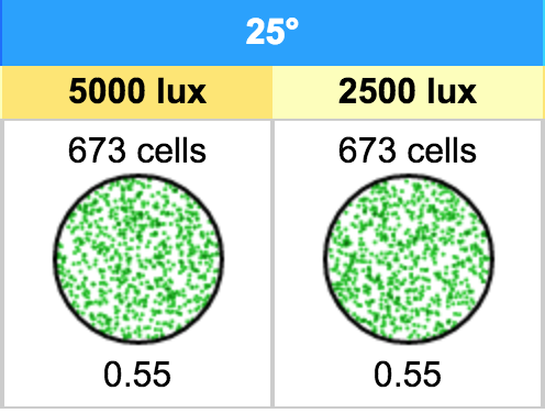
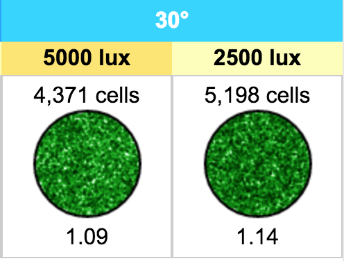
I believe using Petri dishes is EULER-compliant since the image is so familiar, either from high-school biology or any number of movies. What I like about this approach is that it captures the exponential power of each growth rate. And the range in growth rates is stark. For example, one sees the dramatic difference between a five-day growth rate of 1.09 (Nannochlorois oculata at 30° and 5000 lux) versus one of 0.55 (Isochrysis galbana at 25° and 2500 lux), even though they don't appear very far apart on a chart:
Calculations
All the code is open-source and MIT-licensed, so feel free to hack away. Email me if you have any interesting variations or questions about the code. I commented it as best I could.
To crib from the README: It was surprisingly difficult to find a cogent definition of "divisions per day," but this post on Illustrative Mathematics neatly shows how one can calculate the number of cells in an algae bloom (or decline) based on this figure, which is essentially the percentage (in decimal form) of cells that duplicate each day. Thus, for N initial cells, on a given day t with a division count of d, the number of cells is:
Room for Improvement
I spent about an hour looking for reliable information on the colors of different algae species without success. If anyone knows of such a source, I'd be delighted to know.
As I note in the README, this visualization does not account for the fact that algae growth rates decline as the algae gets so thick that not all cells receive the sunlight they need to duplicate. Emulating this phenomenon would arguably be beyond the scope of this visualization.