
Binify + D3 = Gorgeous honeycomb maps
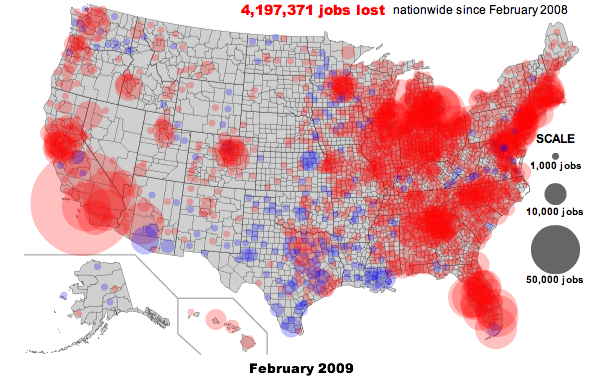
Most Americans prefer to huddle together around urban areas, which raises all sorts of problems for map-based visualizations. Coloring regions according to a data value, known as a choropleth map, leaves the map maker beholden to arbitrary political boundaries and, at the county level, pixel-wide polygons in parts of the Northeast. Many publications prefer to place dots proportional in area to the data values over the center of each county, which inevitably produces overlapping circles in these same congested regions. Here's a particularly atrocious example of that strategy I once made at Slate:
Two weeks ago, Kevin Schaul released an exciting new command-line tool called binify that offers a brilliant alternative. Schaul's tool takes a series of points and clusters them (or "bins" them) into hexagonal tiles. Check out the introductory blog post on his site.
Binify operates on .shp files, which can be a bit difficult to work with for those of us who aren't GIS pros. I put together this tutorial to demonstrate how you can take a raw series of coordinates and end up with a binned hexagonal map rendered in the browser using d3js and topojson, both courtesy of the beautiful mind of Mike Bostock. All the source files we'll need are on Github.
Sample data
I downloaded about 2,000 addresses from a Craigslist-like website and converted them to coordinates with geopy.
Setup
We're going to use one small Python script to create our .shp file. It's recommended you first create and activate a virtualenv with:
virtualenv virt
source virt/bin/activate
Whether or not you use virtualenv:
pip install -r requirements.txtYou also need to install ogr2ogr and topojson for working with the shapefiles.
Conversions
CSV -> SHP
Binify takes as input a .shp file, a format developed by ESRI for geospatial data. Specifically, it needs a "point shapefile" that contains a layer of individual coordinates. (Most .shp files you're likely to encounter consist of a lot of polygons marking territorial boundaries and so forth.) We can make a .shp file from a list of raw coordinates with the pyshp library. The shpify.py script in the Github repo for this demo will take care of this:
./script/shpify.pyIf you look at the source, you'll see this is a very simple process of loading the coordinates from coordinates.csv and writing them to a shapefile, same as you might to when creating a new .csv file in Python.
This script should place a file called output.shp in the shapefiles directory. Pyshp also creates
the companion files output.dbf and output.shx. We also need a projection file, output.prj, so this script manually creates one.
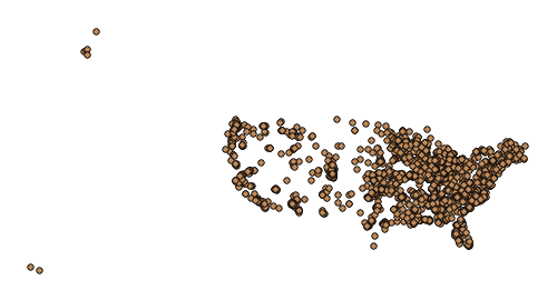
Load these files into an ArcGIS program such as Quantum GIS and you'll see a nice collection of points:
SHP -> Binned SHP
Here is where Binify comes in. Per the documentation, we simply feed it our point shapefile with a few arguments.
First, we want to give it enough hexagons to achieve the granularity we want. 120 hexagons across sounds like a good starting target.
Because these sample coordinates span the United States, we will expect many of the hexagons to encompass 0 points. We can greatly reduce the filesize by including the -e argument, which prevents binify from writing empty polygons.
binify -n=120 -e shapefiles/original.shp shapefiles/binned.shpThis may take a few minutes to run. When finished, you'll have a new set of files named binary.shp and so forth.
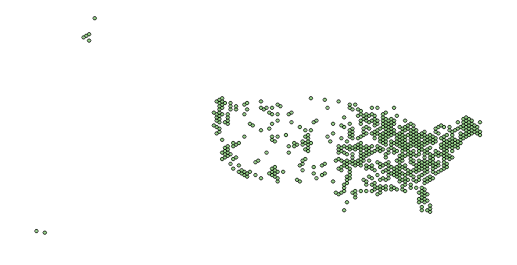
Load those files into QGIS and, like magic, we've got hexagons:
Binned SHP -> GeoJSON -> topoJSON
The mechanics of how to build GeoJSON and topoJSON files are well-documented—see this Stack Overflow Question of mine and and the generous answer from Bostock, for example—so we'll skip to the CLI commands:
ogr2ogr -f GeoJSON binned.json shapefiles/binned.shpMake sure to use the -p flag with the next line to preserve the COUNT property:
topojson -s 7e-9 -p -o coordinates.json — binned.jsonThis reduces the 1.9MB .shp file to an 88KB .json file.
Mapping
We can reuse 90 percent of the code in the d3 choropleth map example, which serves as a nice introduction to topoJSON mapping.
As Schaul notes in his introductory blog post, how you divide your data into color bins is critically important to how viewers interpret the information. In this case, I was lazy and simply colored all the hexagons red and then dimmed them according to the COUNT value (specifically, the square root of the ratio of the value to the maximum value on the map).
And there you have it. If the hexagons look a little too big, just rerun the binify command with a
larger value for n. The following map has been rendered live in your browser:
You can see the map with the code on bl.ocks.org.