Featured Articles
Here are a few clips that I hope capture the diversity of the sort of projects I work on
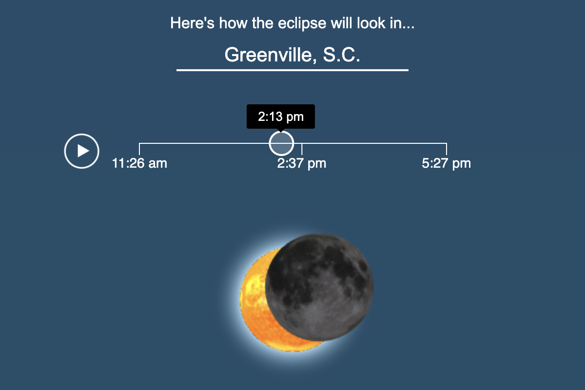
See How the Solar Eclipse Will Look From Anywhere in the U.S.
This is my most ambitious coding project. Rather than precalculate the position of the Sun and the Moon for all 70,000+ locations—which requires sophisticated astrophysics—I modeled the Sun, Earth and Moon in Three.js, then used the camera location to make the interactive location-specific. The results were rigorously fact-checked against NASA's demos and worked out fantastically!
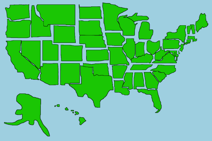
Quiz: See How Well You Can Draw All 50 States
I love experimenting with new technologies that people are not accustomed to see on a news website. This project, like our "Can You Remember Cursive?" Quiz and our Draw the Logo From Memory Quiz uses a sophisticated in-house algorithm to compare how users' drawings—whether with a mouse or a finger—match the correct shape.
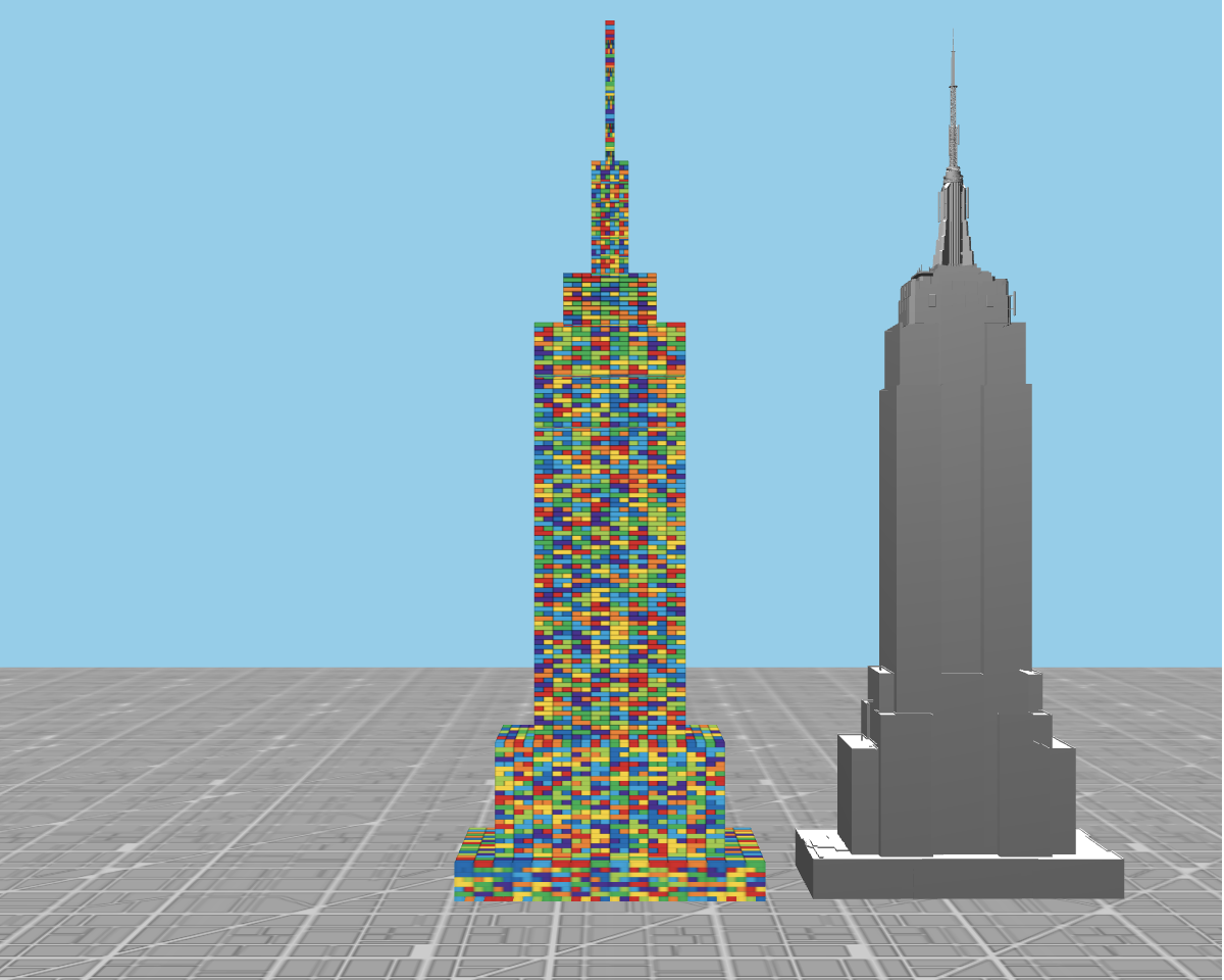
See How Many LEGO Skyscrapers You Could Build With a Year's Worth of Ocean Plastic Waste
Sometimes, a data visualization needs only to communicate the shear scale of a topic that is either huge—the size of the federal budget, say—or vanishingly small—the odds that you'll win the lottery spring to mind. For Earth Day in 2018, which was focused on plastic waste, I wanted to visualize the scale of 8 million tons of plastic pollution. If converted to Lego, could that build the Empire State Building, completely filled in? As it turns out, it could build more than one.
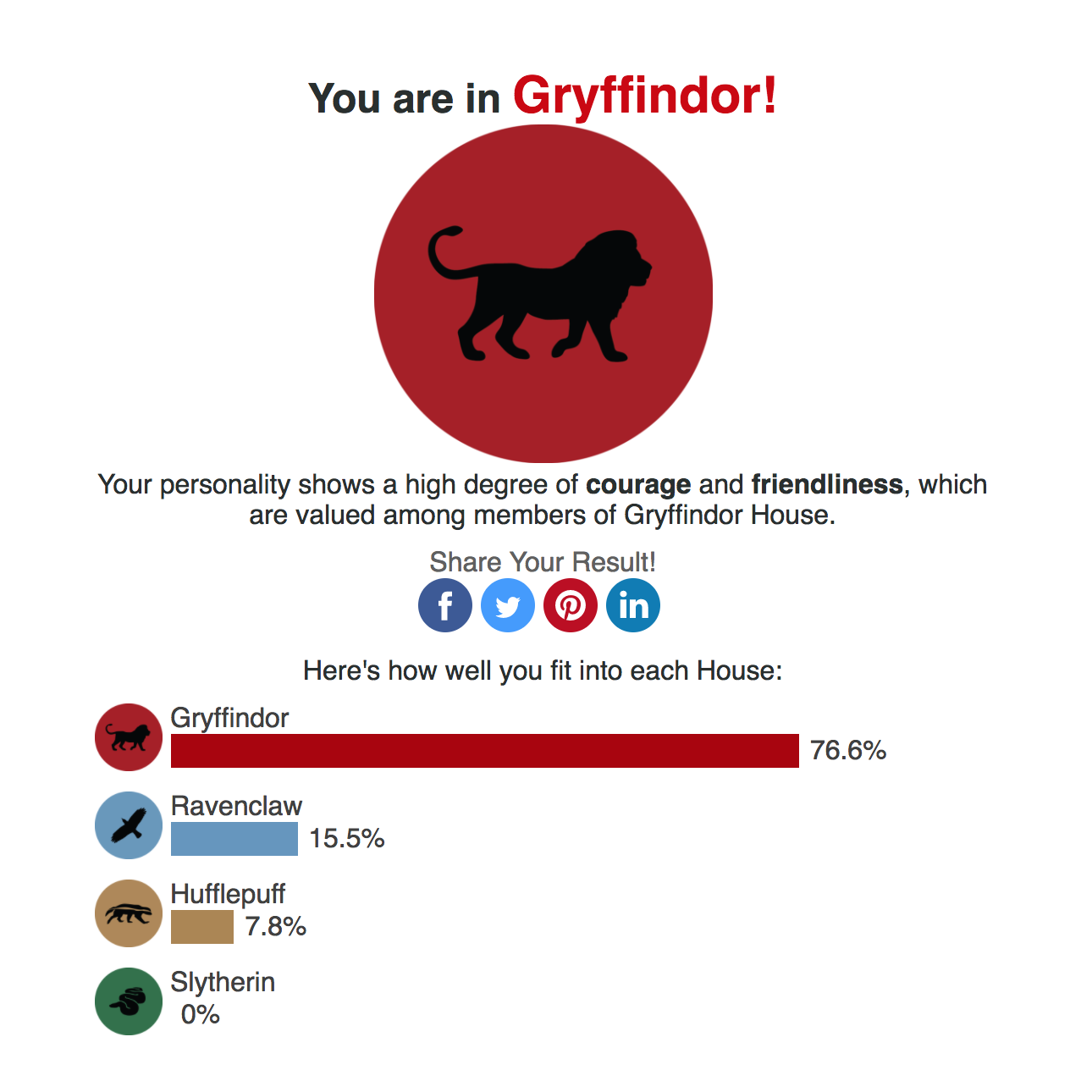
The Ultimate Harry Potter Quiz: Find Out Which House You Truly Belong In
We took a scientific approach to the typical quiz: In partnership with social scientists from Cambridge University, we used an empirical personality survey to place users in one of the four Hogwarts houses. Users could opt-in to contributing their responses to the researchers, who study the geographic distribution of personality. We were able to provide nearly 100,000 participants to their study in addition to getting a feature that brought in millions of page views and stood above your typical online quiz.
See Who You're Most Likely to Marry Based on Where You Live
The data that generated this interactive was a rigorous analysis of several million Census records extracted from IPUMS, a clearinghouse for Census micro-records that allows for sophisticated analyses and cross-tabulations of several hundred variables. I have used it for many projects.
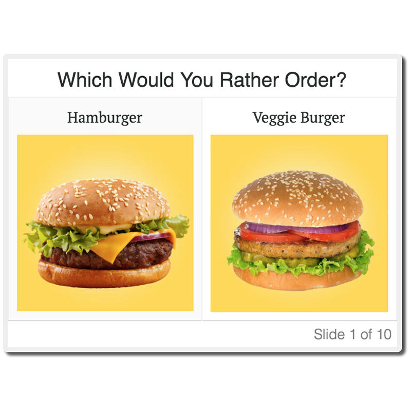
Do You Eat Like a Republican or a Democrat?
I love partnering with third-party companies to analyze their data and produce articles that would otherwise be impossible to calculate using publicly available data—even if the end project is a tad whimsical. Here, GrubHub generously provided TIME with reams of anonymous data on what sorts of foods people order by location, which we cross-referenced with Congressional districts.